Project Name
Rising Path Psychotherapy
Rising Path Psychotherapy
Services Provided
- Brand Identity
Location
Toronto, ON
Industry
Wellness and Mental Health
Year Completed
2025
THE CHALLENGE
After years in a full-time corporate role, Kim Omoruyi was ready to build something of her own: a private psychotherapy practice rooted in the work she felt most called to do. She came to us with a name she loved, Rising Path Psychotherapy, and a clear sense of what she wanted her practice to feel like. The challenge was translating that into a visual identity that would genuinely resonate with her clients.
Her specialty in divorce and life transitions required branding that could hold weight without feeling heavy, something warm and grounding that people in vulnerable moments could trust on sight.

THE GOAL
To craft a brand identity that not only represented the heart of her practice and the deeply personal work of navigating life in transition, but also created an immediate sense of calm and trust for the clients who needed it most. Every visual decision had to do double duty: communicate expertise and communicate safety, so that someone in one of the hardest seasons of their life could land on her page and instantly feel like they were in the right place.
THE SOLUTION
We built her a brand that felt like a exhale.
Soft, grounded, and quietly confident. A visual identity designed to meet clients exactly where they are, with a palette and presence that says: you are safe here, and you are not alone.
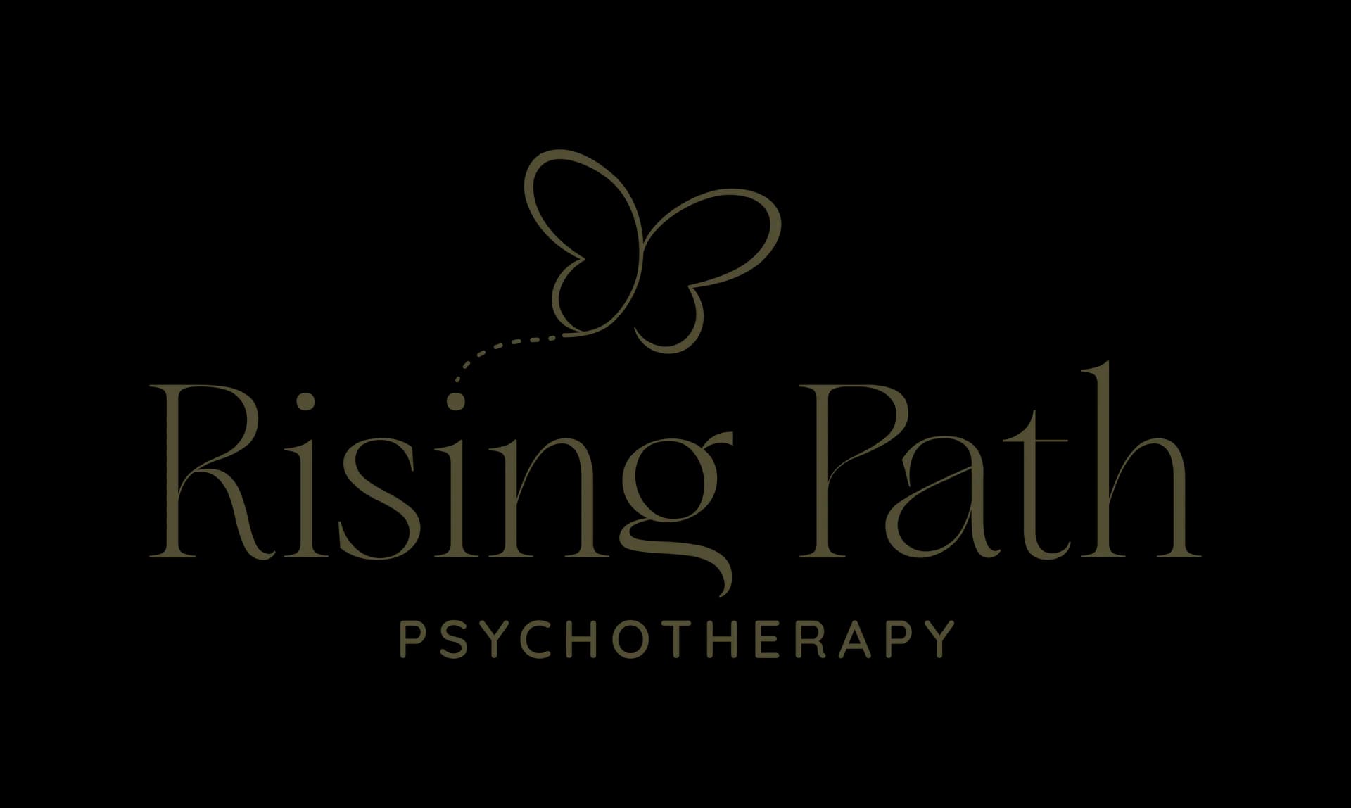
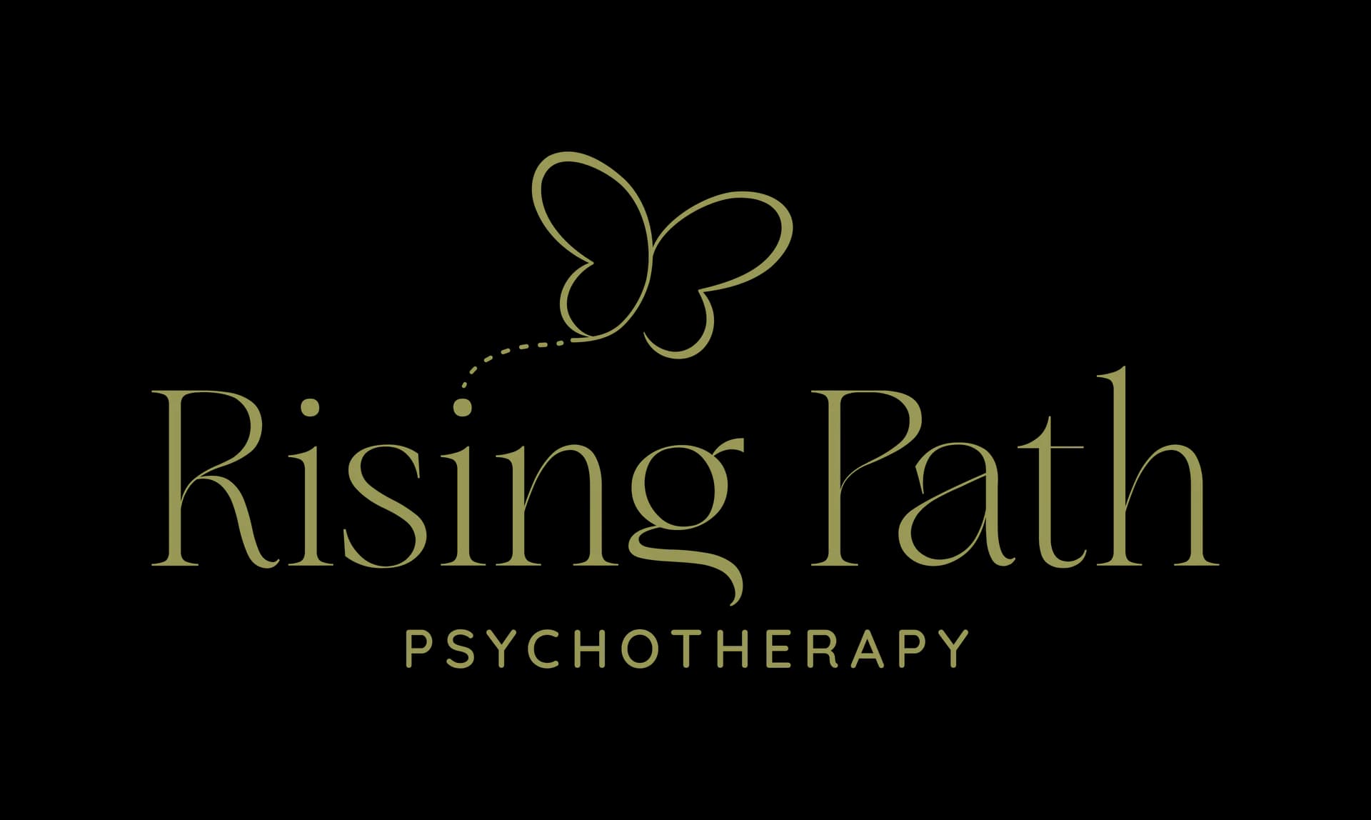
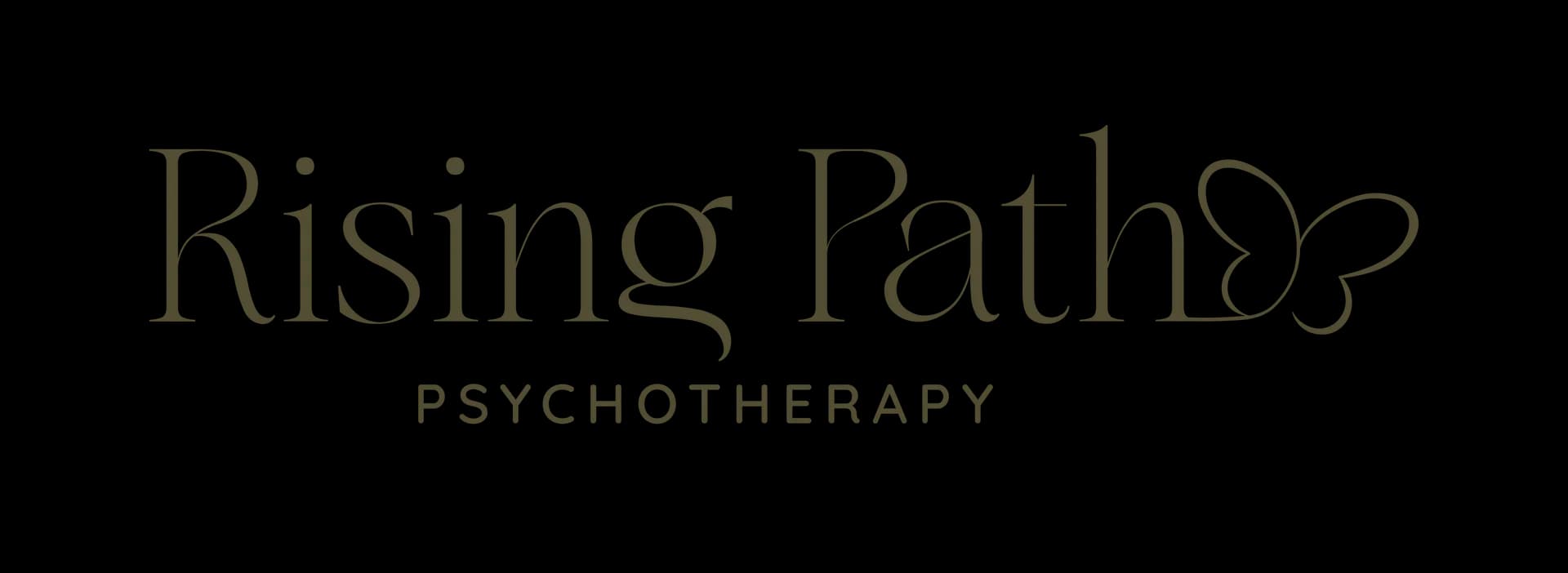
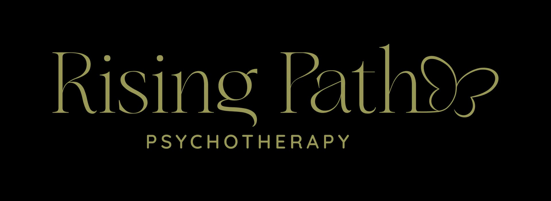
A Symbol That Says Everything Without Saying a Word.
A butterfly mid-flight, drawn from the universal truth of transformation. The logo captures that exact moment of emergence, delicate but full of quiet momentum, and gives Kim's clients a visual anchor for the journey they are already on.
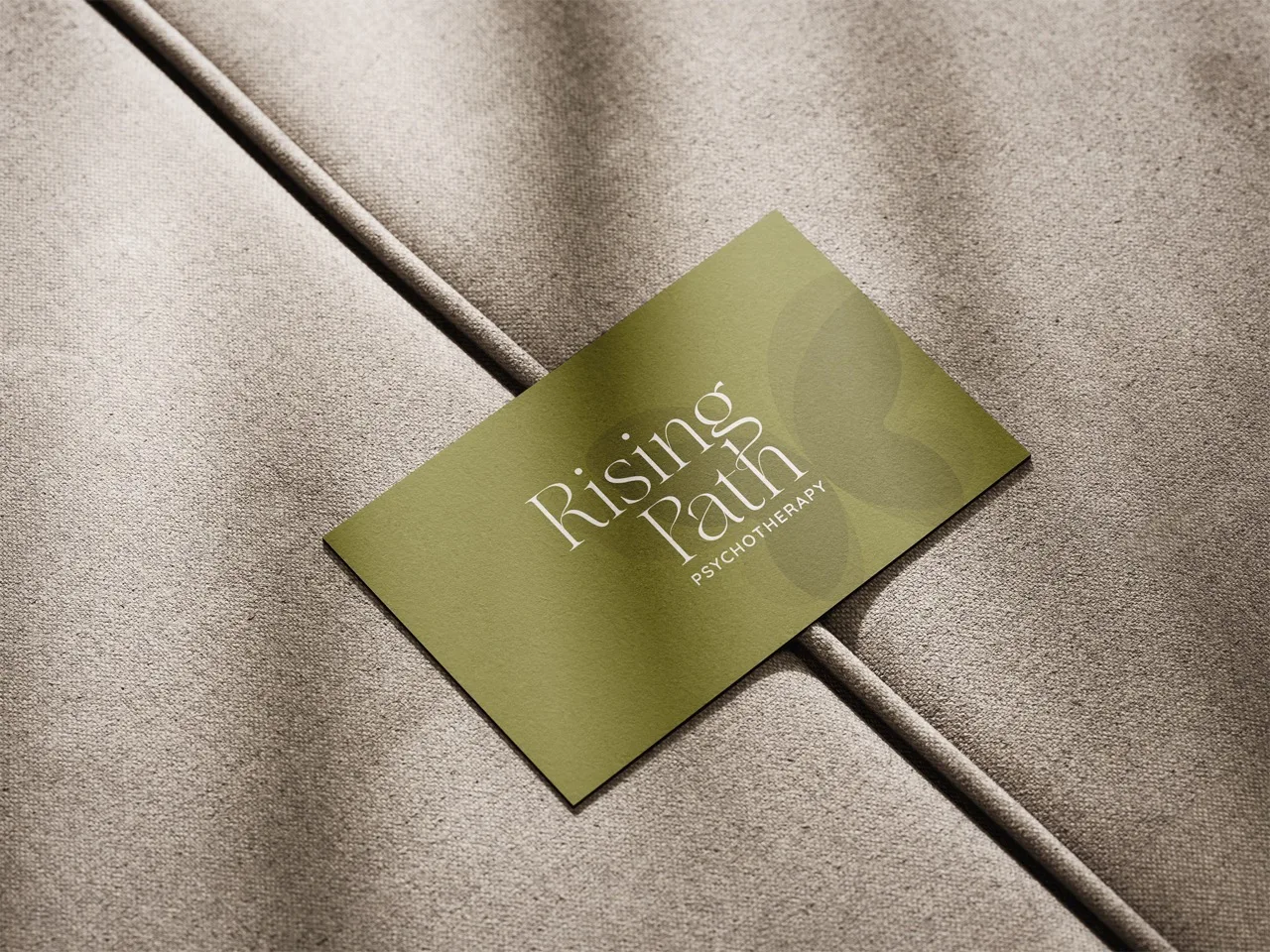
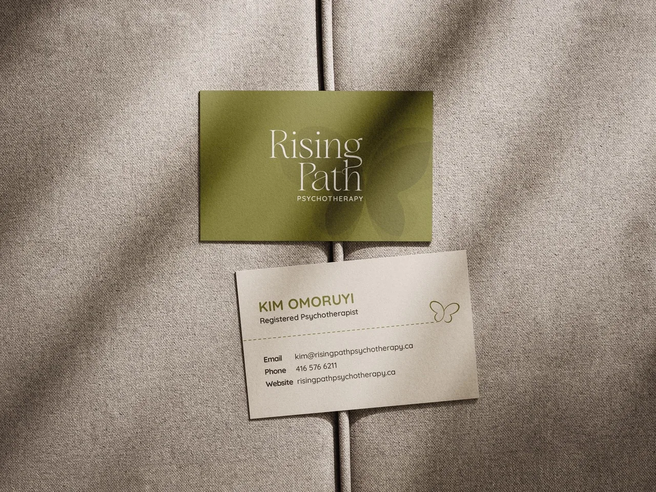
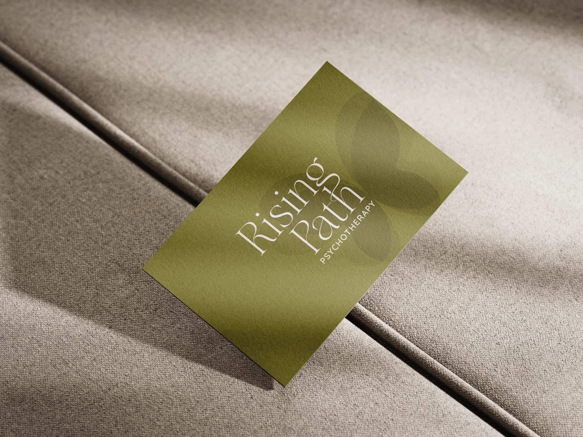
Earthy, Warm, and Steady by Design.
Rooted in nature and chosen with intention. The colour palette draws from soft terracottas, warm creams, and muted sage tones that feel familiar and calming rather than clinical. Colours that hold space the same way a good therapist does.
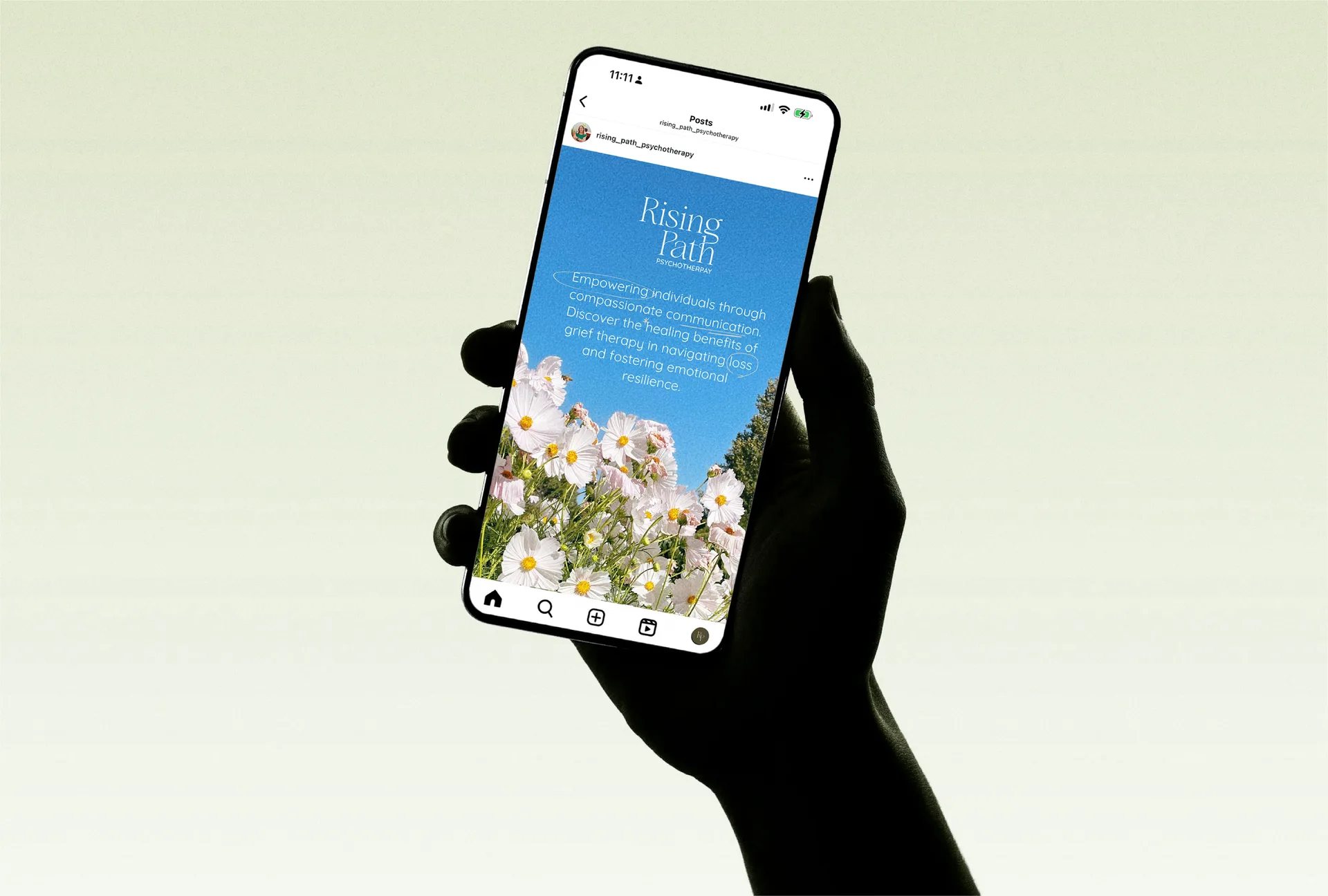
Calm Enough to Reassure. Warm Enough to Connect.
Every word in Kim's brand voice speaks with the same quiet confidence she brings to her practice. No jargon, no distance. Just clear, compassionate language that meets her clients in a vulnerable moment and gently points them forward.
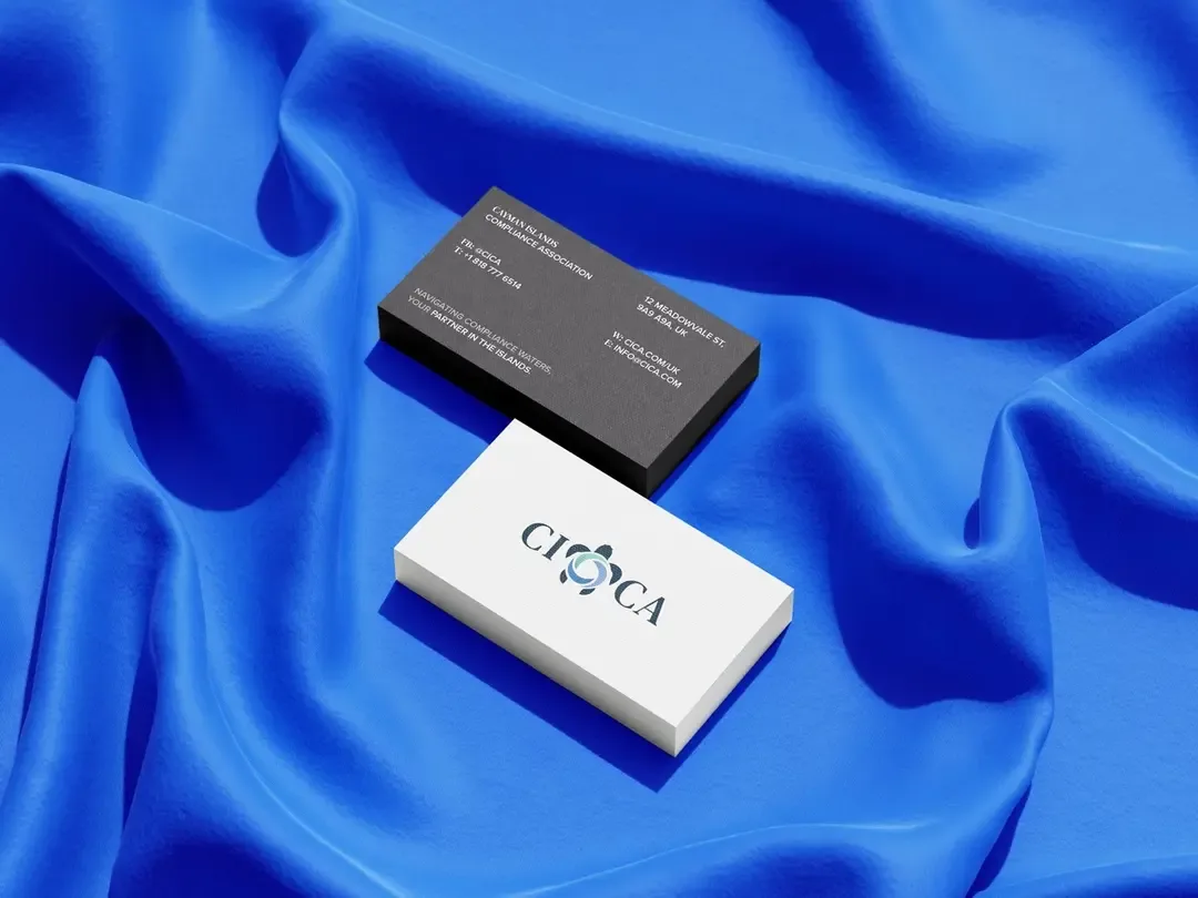
LOGO SUITE

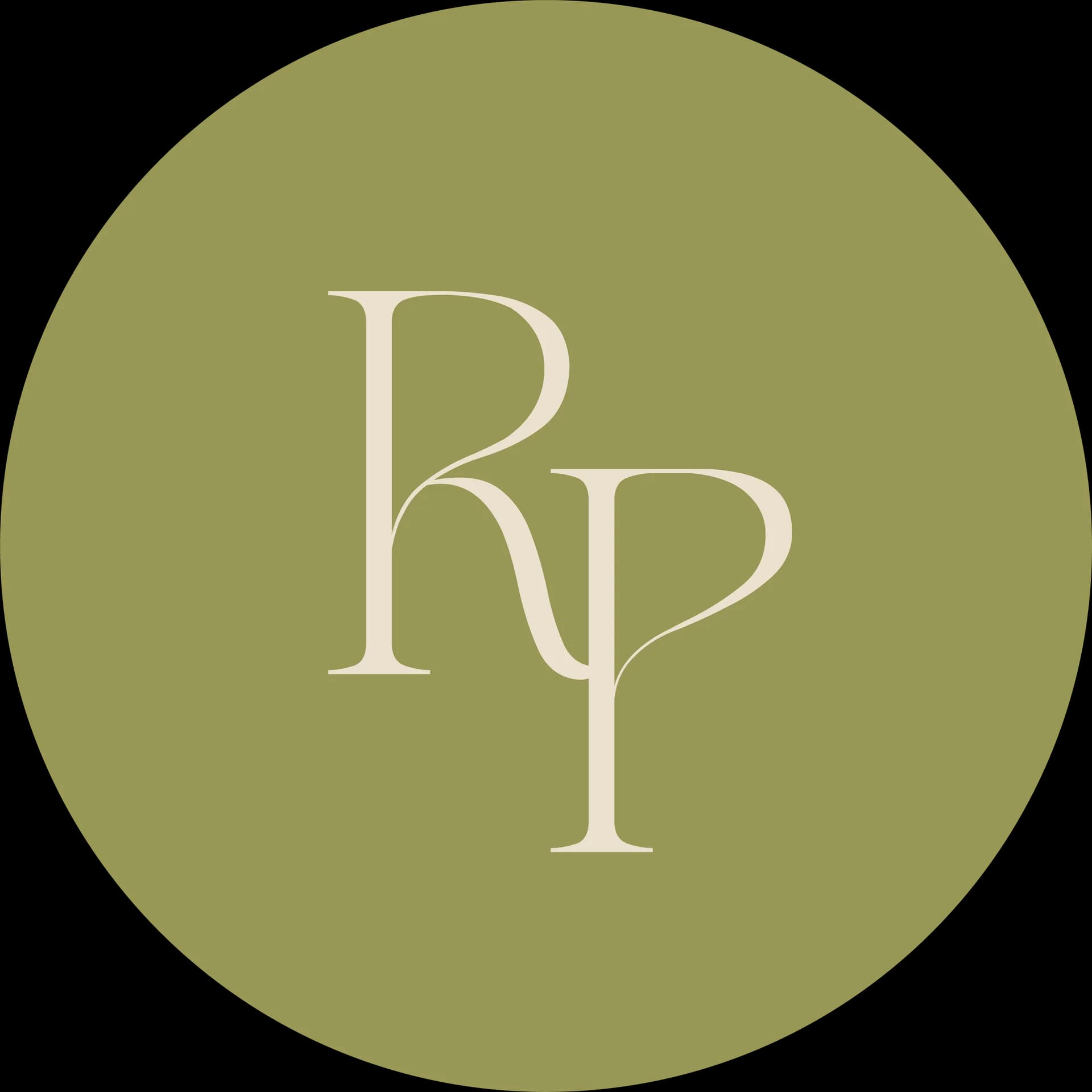
TheIcon
The presence of the sea turtle in this emblem embodies the profound concepts of longevity and protection. CICA Company has consistently dedicated itself to serving its valued customers over the past 23 years and remains steadfast in preserving their trust and confidence into the future.
TheWordmark
The inclusion of swirls was at the specific request of the client, who aimed to symbolize the dynamic waves of the Caribbean Sea, embodying a sense of energy and vitality. These swirls, intentionally enhanced in boldness and prominence compared to the reference image, ensure clear visibility and legibility when utilized or printed at smaller scales.
Typography &Colour Palette
Quicksand
Floreal
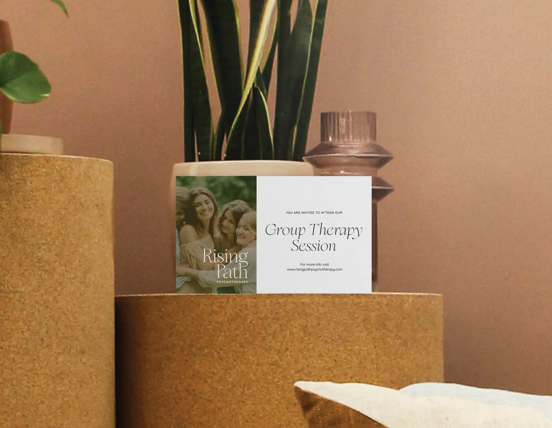
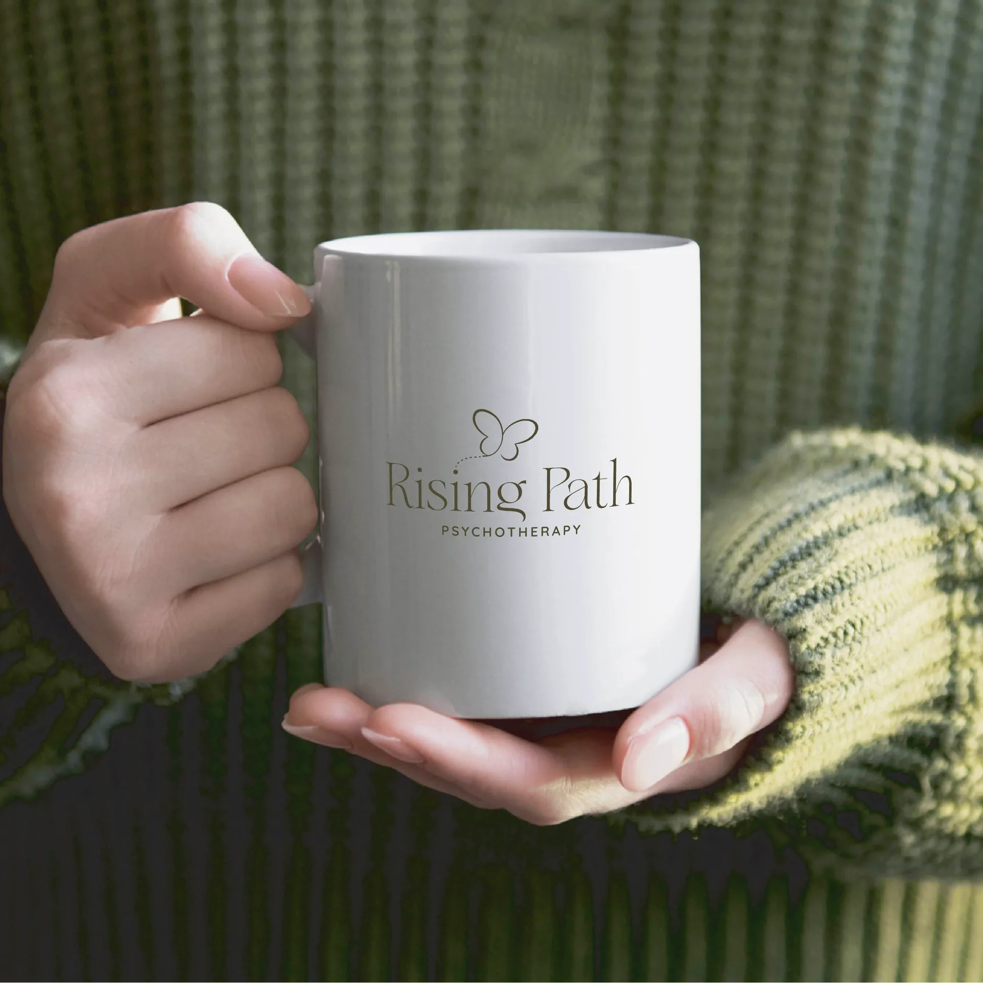
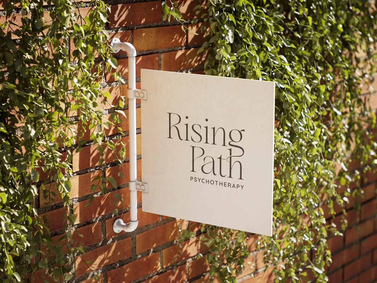
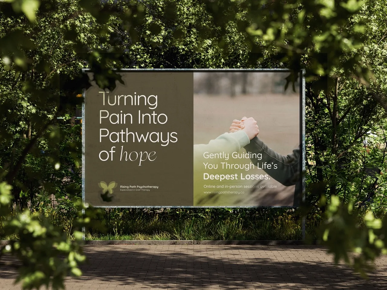
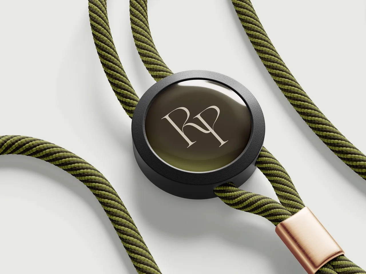
BRAND IN HAND
A identity built to hold its own across every physical touchpoint, from the first impression to the lasting one.
BRAND AS CULTURE
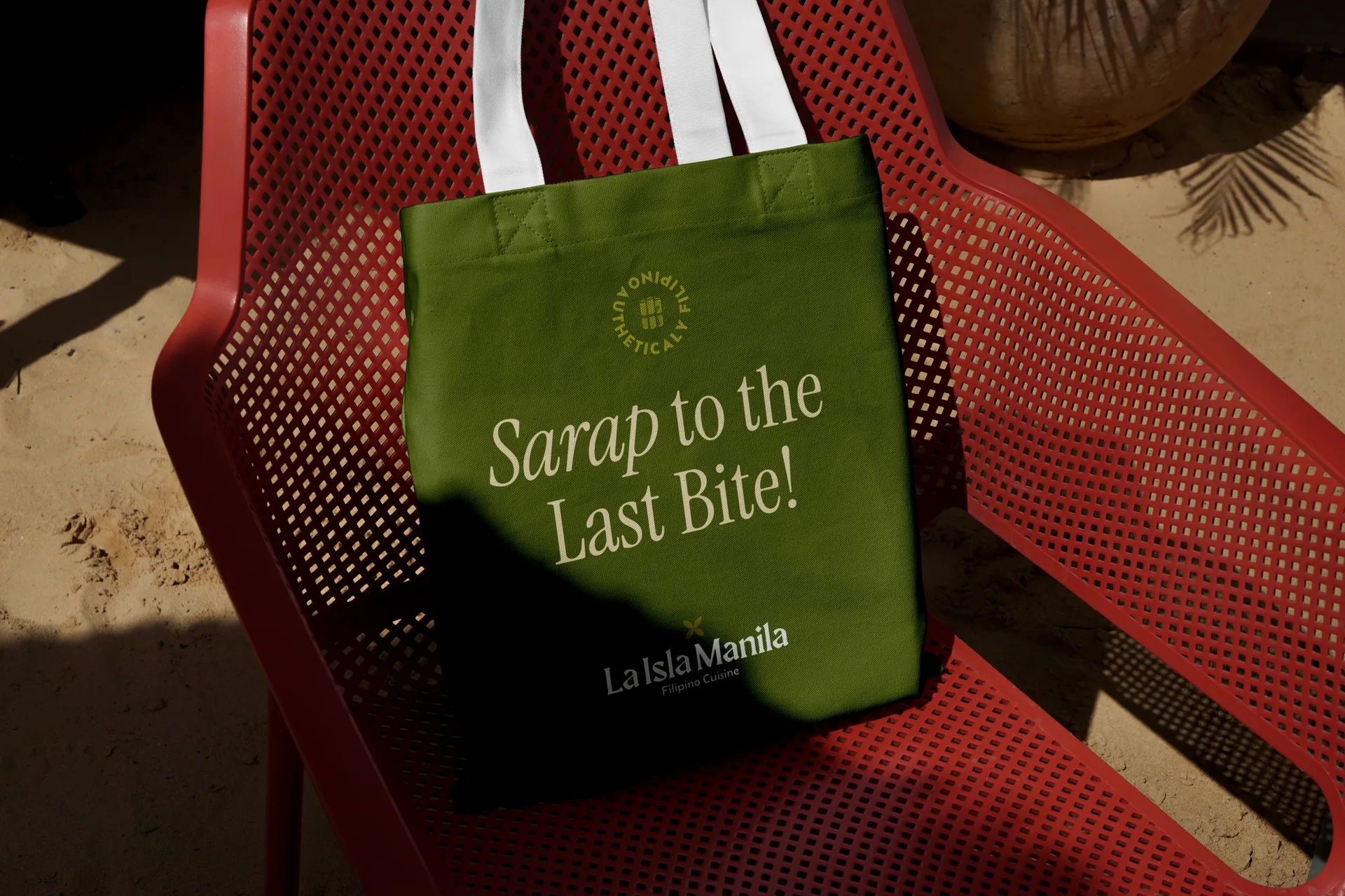
When a brand has genuine roots, it carries naturally into the objects people wear and the spaces they inhabit.
Every brand has a story.